Emily Mae Swimwear
This project focuses on visual merchandising with elements of branding, mock-ups, floorplan, and coherent design.

The Product Line
We will carry tons of different swimsuits in all different sizes and colors, being sure that we can accommodate all people who want to wear bathing suits of our style! As well as cover ups and sarongs, wetsuits for surfing, and even a few dresses for nights out and fancy parties! We will also carry sunglasses, our favorite beachy makeup and skincare brands as well as beach bags, flip flops, and jewelry!
Emily Mae swimwear is named after its two creators Ryan Zimmerman and Emily Wang. The brand identity is Bold, elegant, and adventurous. Our brand draws in consumers that love the beachy-resort wear style. Our clothes are versatile and elegant. They are designed to be perfect for your next beach day or to your finest gala to save the local whales. Our boldness is clearly seen in the bright pops of color in our logo and the pink walls of our store. The beach vibes are brought in with our consistent use of materials like rattan!


About the Brand
The Lighting
We use large circular ceiling lights for the ambient lighting in our store. In order to highlight the clothing racks, we use black spotlights which serve as our task lighting. As for accent lights, we decided to use a rattan chandelier to accentuate the area where we display a mannequin on top of a tabletop display. In our fitting rooms, we use palm tree chandeliers which serve as decorative light that highlights the visual elements of our brand identity.

The Logo
Our logo is a little fish based off of our friends in the waters we love so dearly! We employed the same colors in our logo as we do in our stores, hues of pink, green, and tan.


The Brand Color Palette

The colors used in the store interior are pink, green and tan. The pink coral color evokes energy and creativity while the green contrasts and reminds you of water and earth. While the tan ties you back to the sandy shores the pink hue is the most intense color which draws your eyes towards it and towards the clothing we want to most highlight.

The FloorPlan
We made an easy to navigate floor plan with our customers and their 5 senses in mind. You can touch the clothes, taste a sip from our cafe, see our original graphics and clothes, smell the ocean breeze through our fragrance diffuser, and listen to a curated playlist fit for our target customer. When you enter you walk along the hallway that showcases our surfboard collection as well as shelving for smaller accessories. To the right of the entryway, we have a showcase room, with a two tiered tabletop display, clothing racks, and rattan armoires. As you get to the back of our store we have more clothing displays, our cafe, the fitting rooms, storage room, and our check out desk. We wanted a comfortable fitting room area, as well as a section for friends who wanted to tag along but not shop. Our store is inviting and a nice environment to escape the hustle and bustle of NYC.
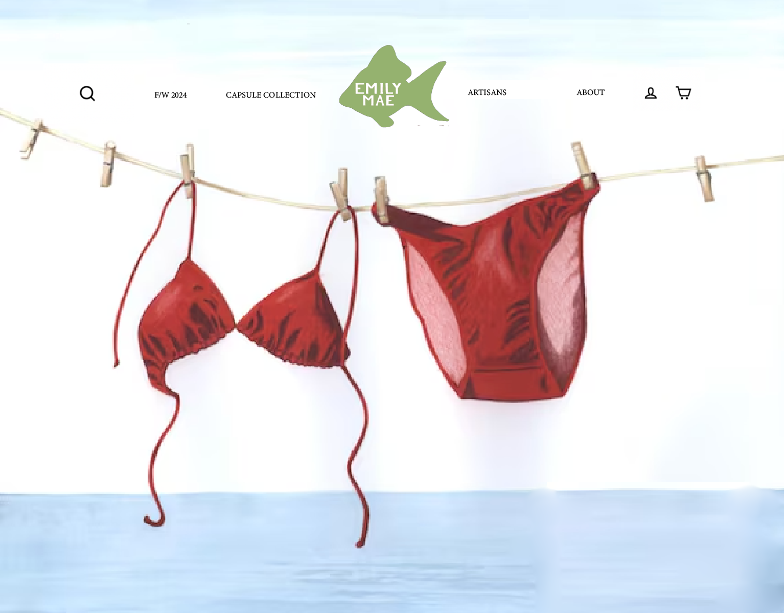
The Website
Our website uses art from local artists to highlight our love for community and people as well as creativity and individuality. Our logo is easily seen and allows us to be easily recognized by customers. The red bathing suit is complementary to the colors of our logo making it appealing to the eye. We decided to categorize our collections by season and capsule collections, as well as our most recent fashion week showcases. We also created a tab to showcase our artisan designers and their stories. Our about page has the backstory of our brand and current collections.

The Storefront
Our storefront showcases three of our mannequins highlighting the one in the center standing on the rattan basket, using a triangular composition. We put both brown and yellow clothing styles on either side while having the blue swimsuit in the center remain the highlight. We also employed the use of palm leaves to frame the scene created. The hue relationship in the window display is green, blue, and tan. The hue relationship is almost an analogous hue relationship because the yellow has just too much warmth to truly be analogous. Between the surf boards and above the models head is our logo in a contrasting color so as to bring attention to itself. We used ambient lighting so that the storefront would all have an evenly lit setting though it is evident the light is from above.